Contents
You may have noticed that the navigation bar or notification bar is in different colors in the mobile applications you use. Brands usually use shades suitable for their own colors in the theme of their mobile applications. You can customize the mobile applications you have developed in this way. How Does? By Material Theme.
In this article, we will take a closer look at the Material Theme. Next, we will examine the built-in themes on the Android platform. And finally, we will create and use a custom theme in Xamarin.Forms.
So let’s get started.
What is the Material Theme?
First of all, I have to talk a little bit about what Material Theme is.
Material Theme is not a system-wide “theme” as you might think. In other words, it is not a setting that the user can choose and change the view. Rather, it’s a basic style you can use to customize the look of your app.
With Material Theme, you can create themes that represent your brand. In other words, by overriding the default colors of Android, you can give any color to areas such as statusBar, navigationBar. Moreover, you can create and use custom themes.
You can even create your own style for the looks. For example, you can change the background color or width of a CarouselView to match your custom theme.
Material Theme started in Xamarin with Android 5.0(Lollipop). So this feature comes built into Android 5.0 and can be used by the application. If you run your application on a version older than Android 5.0, it will revert to the old theme.
Requirements
There are some requirements for using Material Theme in Xamarin applications. If necessary, update the version according to the minimum system requirements below.
Xamarin.Android – Xamarin.Android 4.20 or above
Java JDK 1,8 – JDK 1.7 API level 23 and below. JDK 1.8 Oracle
Android SDK – Android 5,0 (API 21)
Material Theme on Android
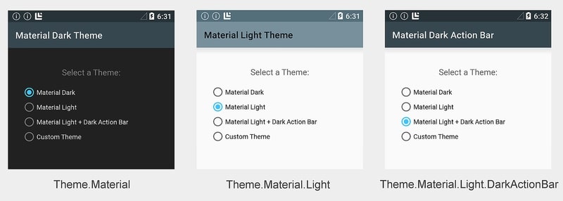
Android provides three types of material themes:
- Theme.Material – Dark version of the material theme; this is a default feature on Android 5.0.
- Theme.Material.Light – Light version of the material theme.
- Theme.Material.Light.DarkActionBar – Light version of the material theme, a dark action bar.
These themes look like this:
There are two ways to use the Material Theme:
1 The first is to use it built-in at the application level without any customization. In other words, you use a single theme throughout the entire application without making any Activity level changes.
2 The other is to use it by configuring an Activity-level theme. This means assigning different themes for each activity. If you want each Activity to have a different appearance, you must create a theme for each Activity.
Application Theme
In Xamarin.Andorid applications, the default theme is Theme.Material. So the dark theme. In this way, the same theme is set throughout the entire application.
To change this theme, you must change the android: theme attribute of the application node in the AndroidManifest.xml file. You can choose from Theme.Material, Theme.Material.Light or Theme.Material.Light.DarkActionBar, which I mentioned above.
<application android:label="MyApp"
             android:theme="@android:style/Theme.Material.Light">
</application>
Alternatively, you can change the Theme attribute in AssemblyInfo.cs as follows.
[assembly: Application(Theme="@android:style/Theme.Material.Light")]Activity Theme
If you want each Activity in your application to have a different appearance, you should use an Activity Theme. To do this, add the [Activity] attribute above each Acitivty definition as follows.
[Activity(Theme = "@android:style/Theme.Material.Light",
          Label = "MyApp", MainLauncher = true, Icon = "@drawable/icon")]
In addition, whichever Activity is set as the Main Launcher, the application icon becomes the icon of that Activity.
Using Custom Themes
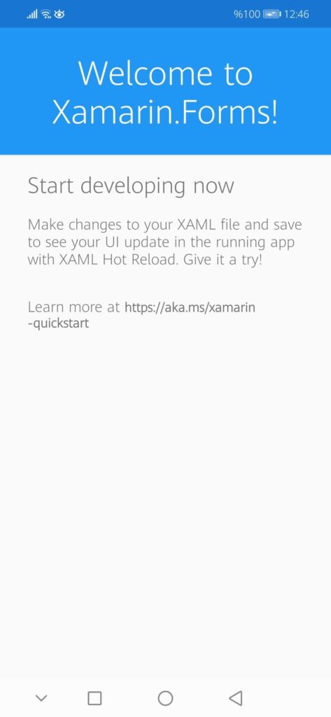
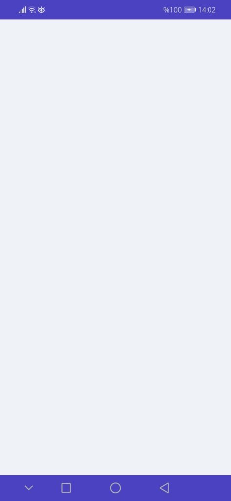
The dark, light and dark themes I mentioned above are those that exist in the native version of Android. In Xamarin.Forms, you will see a theme named “MainTheme” instead of these themes. So the theme we know is in shades of blue. When we first start the application, we actually see the colors set in the MainTheme.
However, you don’t have to use this built-in theme. You can change the MainTheme or design a new theme.
The fields you can customize with Material Theme are:
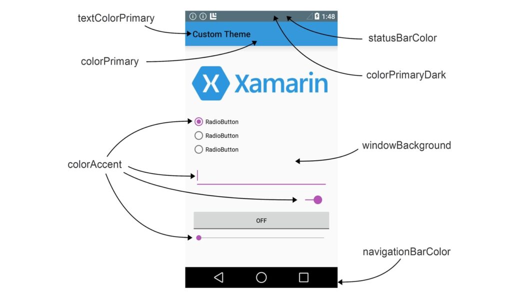
The default color of UI views is as follows. This is what the “MainTheme” of Xamarin.Forms looks like. Let’s change some of the switchable fields.
- statusBarColor – Color of the status bar.
To change statusBarColor add the code below in <style> tag in styles.xml:
<item name="android:statusBarColor">#e6b31e</item>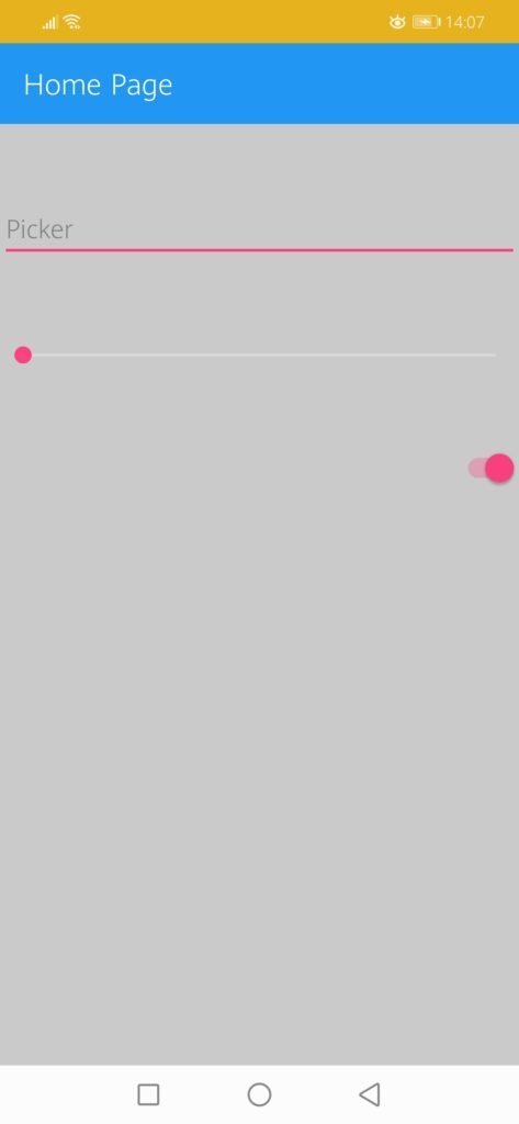
- navigationBarColor – The color of the navigation bar.
To change navigationBarColor add the code below in <style> tag in styles.xml:
<item name="android:navigationBarColor">#e6b31e</item>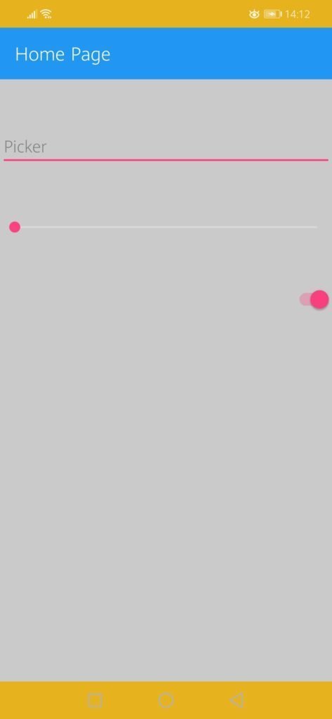
- textColorPrimary – The color of the UI text in the application bar.
To change textColorPrimary add the code below in <style> tag in styles.xml:
<item name="android:textColorPrimary">#01d28e</item>
- colorPrimary – The color of the application bar.
To change colorPrimary add the color code of the colorPrimary that has already been added to the color code of your choice.
<item name="colorPrimary">#f7b71d</item>
- colorAccent – The color of the user interface controls, such as check boxes, radio buttons, and edit text boxes.
To change colorAccent add the color code of the colorAccent that has already been added to the color code of your choice.
<item name="colorAccent">#ab72c0</item>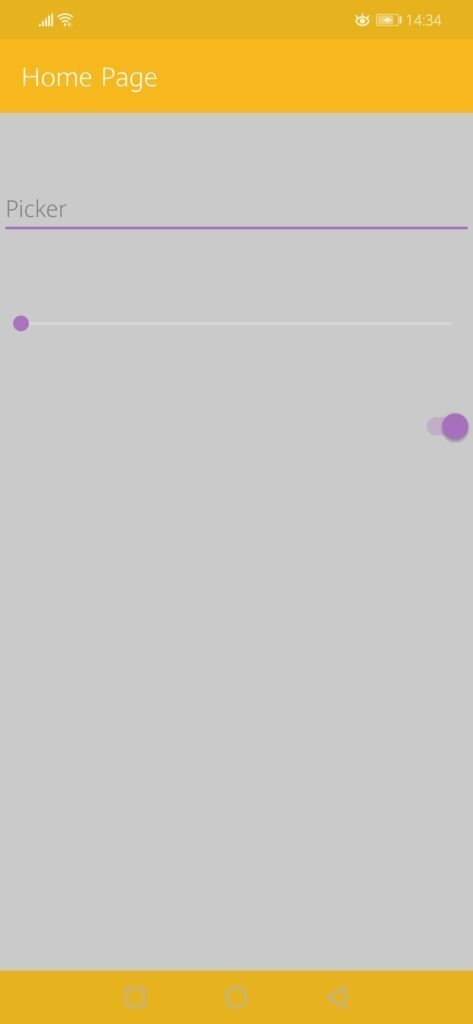
- colorPrimaryDark – Color of status bar and context application bars; this is normally a dark version colorPrimary.
- windowBackground – Color of the screen background.
- colorPrimary– The color of the app bar.
Example of Custom Material Theme
Now let’s understand the subject better by making an example.
Let’s say I want to create a custom theme using # eff1f7 # 4a42bf # 18143d colors in the mobile application I will develop. To do this, I have to follow the ways below.
1 First of all, I define my custom theme colors in colors.xml file. I will use these colors that I defined later in styles.xml. That’s why I do the namings myself.
<resources>
<color name="grey">#eff1f7</color>
<color name="purple">#4a42bf</color>
<color name="black">#18143d</color>
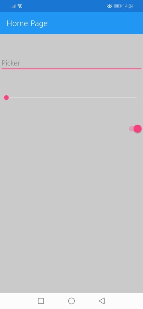
</resources>2 Next, I define a custom theme inside the styles.xml file. This theme will inherit from the base theme in Xamarin. Then, to change the color of the fields such as statusBarColor, navigationBarColor, I give the colors that I have defined in the color.xml inside the tag.
I want to make the color of the statusBarColor and navigationBarColor purple and the windowBackground to gray.
  <style name="CustomTheme" parent="MainTheme.Base">

    <item name="android:statusBarColor">@color/purple</item>
    <item name="android:windowBackground">@color/grey</item>
    <item name="android:navigationBarColor">@color/purple</item>

  </style>
Of course, you can customize the fields you want. Above is the list of the fields that can be customized.
3 Finally, I open the MainActivity class on the .Android side. Before the class definition, I replace the [Activity] attribute Theme with my custom theme.
[Activity(Label = "XamarinSpotify", Icon = "@mipmap/icon", Theme = "@style/CustomTheme", MainLauncher = true, ConfigurationChanges = ConfigChanges.ScreenSize | ConfigChanges.Orientation | ConfigChanges.UiMode | ConfigChanges.ScreenLayout | ConfigChanges.SmallestScreenSize )]After completing the steps, I run the application and see how it looks.
The difference in appearance between Xamarin’s default MainTheme and my own custom theme.
Conclusion
In summary, design is very important in mobile applications. The theme of the application you designed should reflect the identity of your brand to the user. Therefore, creating your custom theme instead of the default themes will provide a better user experience.
With the Material Theme, it is possible to make changes to the built-in themes. You can use different themes either throughout the application or in Activity specific.
What’s more, you can also create your own custom theme with Material Theme. Thus, you will reflect the identity of your brand to the user in the most accurate way.
If you’re still not sure what to do, then I suggest you use the comment section below and let me know! I am here to help!
Related Links