Resource Dictionaries is a repository of resources created to customize XAML views. These resources include properties of view items such as colors, controls, data templates. So when you want to customize a view element, you can make customizations by referring to these resources.
For example, by referring to the resource dictionaries, you can ensure that all buttons in the application have the same appearance or only the Labels on a XAML page appear in the same template.
In applications with a large number of view elements, it is better to create and refer to application-level resources rather than customizing each element individually.
You can reference resources defined in ResourceDictionary in XAML and apply them to elements Dynamically or Statically.
StaticResources is the application of resources to view items that won’t change at runtime.
DynamicResources is the application of resources to view items that can change at run time.
How Does Resource Search Behavior Work?
Resource search behavior in a Xamarin.Forms application occurs in the visual tree in the following order:
- First, the searched key for the item whose property is set is returned if its value exists in the source dictionary, otherwise the search process ends.
- Then, if no matches are found, the search operation searches the visual tree upwards and checks the source dictionary for each main element. If the requested key is found, its value is returned, otherwise the search process ends.
- After, if no match is found in the root element, the application-level resource dictionary is examined.
- Finally, if a match is still not found, a XamlParseException is eventually thrown.
Creating Resource Dictionaries in XAML
Resources are created with Style in Resources in the XAML element you want to source. You can define which type of element the resource will be applied to with TargetType in Style, and a string key belonging to this Style with x:Key. Except for implicit styles, each resource in the source dictionary must have a unique string key identified with the x:Key attribute.
Then, customizations are made to the properties of TargetType with Setters in Style.
Where you create resource dictionaries affects where resources are available.
- You can apply resources in source controls to a specific view element such as Label, Button.
- Or to a specific layout such as StackLayout or Grid and its children.
- With page-level source controls, a page and all of its children.
- Resources within application-level source controls across the application.
Views-Specific Resource Dictionaries
You can create and apply a separate source for each view element such as Button, Label in XAML.
To create a view-level resource, define Style under Resources in the view element definition. Then specify which type of XAML control you want to apply this resource to with TargetType.
In the code snippet below, you can see a button specific resource in StackLayout. Since this resource will only change the appearance of this button, the other button without source control has the default view of Xamarin.Forms.
<?xml version="1.0" encoding="utf-8" ?>
<ContentPage xmlns="http://xamarin.com/schemas/2014/forms"
             xmlns:x="http://schemas.microsoft.com/winfx/2009/xaml"
             x:Class="Blog.Views.ViewResources">
    <ContentPage.Content>
        <StackLayout HorizontalOptions="Center" VerticalOptions="Center">
            <Button Text="BUTTON">
                <Button.Resources>
                    <Style TargetType="Button">
                        <Setter Property="FontSize" Value="20" />
                        <Setter Property="BackgroundColor" Value="#eb5e0b" />
                        <Setter Property="TextColor" Value="#ffffff" />
                        <Setter Property="CornerRadius" Value="15" />
                        <Setter Property="WidthRequest" Value="200" />
                        <Setter Property="HeightRequest" Value="100" />
                    </Style>
                </Button.Resources>
            </Button>
            <Button Text="BUTTON"/>
        </StackLayout>
    </ContentPage.Content>
</ContentPage>
Layout-Specific Resource Dictionaries
You can create custom source controls for layouts such as Grid, StackLayout, AbsoluteLayout in XAML. Thus, the resources you create affect only the view items in that layout. Views within other layouts appear with default values of Xamarin.Forms.
To create a custom source control for the layout, define Style under Resources in the definition of that layout. Then specify which type of XAML control you want to apply this resource to with TargetType. Then set a custom string key to TargetType with the x: Key attribute. Like PrimaryButton, SecondaryButton. Then give this key to XAML.
There are two Grid layouts in ContentPage in the code snippet below.
Since there is a source control specific to the first Grid layout, the buttons in this Grid structure first appear according to the values set in the source. In other words, the first button appears according to the values that have the PrimaryButton x: Key attribute, while the second button appears according to the values that have this attribute because it has the SecondaryButton x: Key attribute.
The buttons in this Grid have the default Button appearance of Xamarin.Forms, as there is no specific resource to the Other Grid layout.
<?xml version="1.0" encoding="utf-8" ?>
<ContentPage xmlns="http://xamarin.com/schemas/2014/forms"
             xmlns:x="http://schemas.microsoft.com/winfx/2009/xaml"
             x:Class="Blog.Views.LayoutResources">
    <ContentPage.Content>
        <StackLayout  VerticalOptions="Center" HorizontalOptions="Center">

            <Grid>
                <Grid.Resources>
                    <Style x:Key="PrimaryButton" TargetType="Button">
                        <Setter Property="FontSize" Value="20" />
                        <Setter Property="BackgroundColor" Value="#eb5e0b" />
                        <Setter Property="TextColor" Value="#ffffff" />
                        <Setter Property="CornerRadius" Value="15" />
                        <Setter Property="WidthRequest" Value="100" />
                        <Setter Property="HeightRequest" Value="100" />
                    </Style>
                    <Style x:Key="SecondaryButton" TargetType="Button">
                        <Setter Property="FontSize" Value="20" />
                        <Setter Property="BackgroundColor" Value="#314e52" />
                        <Setter Property="TextColor" Value="#ffffff" />
                        <Setter Property="CornerRadius" Value="15" />
                        <Setter Property="WidthRequest" Value="100" />
                        <Setter Property="HeightRequest" Value="100" />
                    </Style>
                </Grid.Resources>
                <Grid.RowDefinitions>
                    <RowDefinition Height="Auto"/>
                    <RowDefinition Height="Auto"/>
                </Grid.RowDefinitions>

                <Button Text="BUTTON" Style="{StaticResource PrimaryButton}" Grid.Row="0"/>
                <Button Text="BUTTON" Style="{StaticResource SecondaryButton}" Grid.Row="1"/>
            </Grid>

            <Grid>
                <Grid.RowDefinitions>
                    <RowDefinition Height="Auto"/>
                    <RowDefinition Height="Auto"/>
                    <RowDefinition Height="Auto"/>
                </Grid.RowDefinitions>
                <Button Text="BUTTON" Grid.Row="0"/>
                <Button Text="BUTTON" Grid.Row="1"/>
                <Button Text="BUTTON" Grid.Row="2"/>
            </Grid>

        </StackLayout>
    </ContentPage.Content>
</ContentPage>
Page-Level Resource Dictionaries
You can create source controls specific to pages such as ContentPage, NavigationPage, TabbedPage in XAML. Thus, the resources you create affect only the view items on that page. Views within other pages appear with the default values of Xamarin.Forms.
To create a page-level resource, define Style under Resources in the page definition. Then specify which type of XAML control you want to apply this resource to with TargetType. Later, if you wish, you can define a string key specific to TargetType with the x: Key attribute and then set this key to the corresponding XAML element.
You can see a source control specific to ContentPage in the code snippet below. Since this resource is exclusive to the Button and Label views of this page only, other view items that have no source control added have the default view of Xamarin.Forms. Also, the resources on this page do not affect view elements in another ContentPage.
<?xml version="1.0" encoding="utf-8" ?>
<ContentPage xmlns="http://xamarin.com/schemas/2014/forms"
             xmlns:x="http://schemas.microsoft.com/winfx/2009/xaml"
             x:Class="Blog.Views.PageResources">
    <ContentPage.Resources>
        <ResourceDictionary>
            <Style TargetType="Button">
                <Setter Property="FontSize" Value="20" />
                <Setter Property="BackgroundColor" Value="#eb5e0b" />
                <Setter Property="TextColor" Value="#ffffff" />
                <Setter Property="CornerRadius" Value="15" />
                <Setter Property="WidthRequest" Value="100" />
                <Setter Property="HeightRequest" Value="100" />
            </Style>
            <Style TargetType="Label">
                <Setter Property="BackgroundColor" Value="Pink"/>
                <Setter Property="FontSize" Value="24"/>
                <Setter Property="FontAttributes" Value="Bold"/>
            </Style>
        </ResourceDictionary>
    </ContentPage.Resources>
    <ContentPage.Content>
        <StackLayout HorizontalOptions="Center" VerticalOptions="Center">
            <Label Text="Welcome to Xamarin.Forms!"
                VerticalOptions="CenterAndExpand"
                HorizontalOptions="CenterAndExpand" />

            <Button Text="BUTTON" />
            <Button Text="BUTTON" />
            <Button Text="BUTTON" />
        </StackLayout>
    </ContentPage.Content>
</ContentPage>
Application-Level Resource Dictionaries (Seperate File)
By creating an application-level source control in Xamarin.Forms, you can ensure that your customizations apply to all XAML views. So you don’t need to create any XAML element or page specific resources.
To add an application-level source control, follow the steps below in order.
1) Create stand-alone source controls
It is a stand-alone XAML file that inherits independent source controls from the ResourceDictionary class. These XAML files can then be used in the application like other XAML files.
For this sample project, I will create a resource named DarkTheme.xaml and then call this resource in App.xaml.
1 First, add a ContentPage or ContentView to your Xamarin.Forms project. I added a ContentPage named DarkTheme.xaml to this sample project.
2 Next, go to the code side of the XAML file you just created and have this page inherit from the ResourceDictionary class. I made this change in the DarkTheme.xaml.cs class.
public partial class DarkTheme : ResourceDictionary
{
    public DarkTheme()
    {
        InitializeComponent();
    }
}
3 Then go to the XAML page you just added and replace the ContentPage definition with ResourceDictionary. Thus, you will have made the same change in XAML as you made on the code side.
Finally, add your resources into ResourceDictionary.
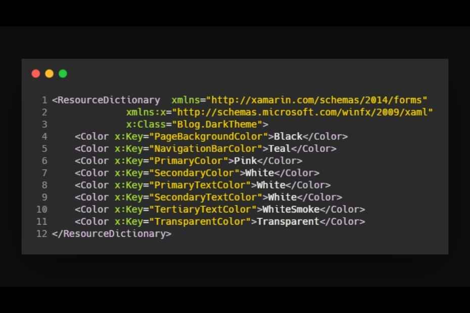
<?xml version="1.0" encoding="utf-8" ?>
<ResourceDictionary  xmlns="http://xamarin.com/schemas/2014/forms"
             xmlns:x="http://schemas.microsoft.com/winfx/2009/xaml"
             x:Class="Blog.DarkTheme">
    <Color x:Key="PageBackgroundColor">Black</Color>
    <Color x:Key="NavigationBarColor">Teal</Color>
    <Color x:Key="PrimaryColor">Pink</Color>
    <Color x:Key="SecondaryColor">White</Color>
    <Color x:Key="PrimaryTextColor">White</Color>
    <Color x:Key="SecondaryTextColor">White</Color>
    <Color x:Key="TertiaryTextColor">WhiteSmoke</Color>
    <Color x:Key="TransparentColor">Transparent</Color>
</ResourceDictionary>
I made color definitions only for the dark theme in DarkTheme.xaml. You can create as many independent source controls and add resources as you want.
2) Define your resources in App.xaml
After creating the stand-alone source controls, you must call the independent sources in the resources in App.xaml.
You can also create resources for XAML view items to resources in App.xaml. Thus, the customizations you apply for your target items will be applied throughout the application.
App.xaml codes
<?xml version="1.0" encoding="utf-8" ?>
<Application xmlns="http://xamarin.com/schemas/2014/forms"
             xmlns:x="http://schemas.microsoft.com/winfx/2009/xaml"
             x:Class="Blog.App">
    <Application.Resources>
        <!--<ResourceDictionary Source="DarkTheme.xaml" />-->

        <!-- Colors -->
        <Color x:Key="BackgroundColor">#c7ffd8</Color>
        <Color x:Key="PrimaryColor">#493323</Color>
        <Color x:Key="SecondaryColor">#314e52</Color>
        <Color x:Key="TextColor">#ffe227</Color>

        <!-- Implicit styles -->
        <Style TargetType="{x:Type ContentPage}">
            <Setter Property="BackgroundColor" Value="{StaticResource BackgroundColor}" />
        </Style>

        <Style TargetType="{x:Type Button}">
            <Setter Property="BackgroundColor" Value="{StaticResource PrimaryColor}"/>
            <Setter Property="TextColor" Value="{StaticResource TextColor}"/>
            <Setter Property="HorizontalOptions" Value="Center"/>
            <Setter Property="VerticalOptions" Value="Center"/>
            <Setter Property="CornerRadius" Value="10"/>
        </Style>

        <Style TargetType="{x:Type Label}">
            <Setter Property="FontSize" Value="32" />
            <Setter Property="BackgroundColor" Value="{StaticResource SecondaryColor}" />
            <Setter Property="TextColor" Value="{StaticResource TextColor}" />
        </Style>

    </Application.Resources>
</Application>
ContentPage codes
<?xml version="1.0" encoding="utf-8" ?>
<ContentPage xmlns="http://xamarin.com/schemas/2014/forms"
             xmlns:x="http://schemas.microsoft.com/winfx/2009/xaml"
             x:Class="Blog.Views.ResourceDictionaryPage"
             BackgroundColor="{StaticResource BackgroundColor}">

    <ContentPage.Content>
        <StackLayout VerticalOptions="Center" HorizontalOptions="Center">
            <Button Text="BUTTON"/>
            <Button Text="BUTTON"/>
            <Label Text="LABEL" />
        </StackLayout>
    </ContentPage.Content>
</ContentPage>
Conclusion
In this article I explained what a Resource Dictionary is and how to consume resources in Xamarin.Forms applications. I hope it was useful.
If you’re still not sure what to do, or if you got any errors, then I suggest you use the comment section below and let me know! I am here to help!
Also, share this blog post on social media and help more people learn.